---
title: "Figures in R"
---
# Picking a Chart Type
<https://www.data-to-viz.com>
# Gallery
<https://www.r-graph-gallery.com>
# Resources for Learning `R` Syntax for Figures
<https://www.statmethods.net/graphs/index.html>
<http://www.cookbook-r.com/Graphs/>
# Font {#sec-font}
You can download the lab fonts for figures here[^1]: <https://drive.google.com/drive/u/0/folders/1fqlrnEe7NFnWZoIrsHmr8ulDS4nhs-H3>
```YAML
---
knitr:
  opts_chunk:
    fig-showtext: true
---
```
````markdown
```{r}`r ''`
library(showtext)
font_add(
family = "Gotham",
regular = "fonts/Gotham-Book.otf",
bold = "fonts/Gotham-Bold.otf",
italic = "fonts/Gotham-BookItalic.otf",
bolditalic = "fonts/Gotham-BoldItalic.otf"
)
showtext_auto()
showtext_opts(dpi = 300) # may not be necessary
```
````
# `ggplot2` Themes for Publication and Presentation {#sec-ggplot2Themes}
```{r}
library("ggplot2")

publication_theme <- theme_classic(base_size = 16) +
  theme(text = element_text(family = "Arial")) # "Gotham"

publication_theme_bw <- theme_bw(base_size = 16) +
  theme(
    panel.grid.major = element_blank(),
    panel.grid.minor = element_blank(),
    text = element_text(family = "Arial")) # "Gotham"

presentation_theme <- theme_classic(base_size = 30) +
  theme(text = element_text(family = "Arial")) # "Gotham"

presentation_theme_bw <- theme_bw(base_size = 30) +
  theme(
    panel.grid.major = element_blank(),
    panel.grid.minor = element_blank(),
    text = element_text(family = "Arial")) # "Gotham"
```
Usage:
```r
ggplot(df, aes(x = predictor, y = outcome)) +
  geom_point() +
  publication_theme
```
# Saving Figures {#sec-savingFigures}
## PDF
```r
ggsave(
  filename = "figure.pdf",
  plot = nameOfggplotObject,
  device = cairo_pdf,
  width = 9,
  height = 6.5,
  units = "in")
```
## SVG
```r
ggsave(
  filename = "figure.svg",
  plot = nameOfggplotObject,
  width = 9,
  height = 6.5,
  units = "in")
```
## PNG
```r
ggsave(
  filename = "figure.png",
  plot = nameOfggplotObject,
  width = 9,
  height = 6.5,
  units = "in",
  dpi = 300)
```
# Petersen Lab Examples
<https://research-git.uiowa.edu/PetersenLab/R-Plotting/-/tree/main/Analyses>
## Preamble
### Install Libraries
```{r}
#install.packages("remotes")
#remotes::install_github("DevPsyLab/petersenlab")
```
### Load Libraries
```{r}
library("petersenlab")
library("ellipse")
library("ggplot2")
library("grid")
library("reshape")
library("plyr")
library("RColorBrewer")
library("reshape2")
library("ggExtra")
library("viridis")
library("ggthemes")
library("ggpubr")
library("patchwork")
```
## Simulate Data
```{r}
set.seed(52242)

n <- 1000

predictor <- rbeta(n, 1.5, 5) * 100
outcome <- predictor + rnorm(n, mean = 0, sd = 20) + 50
number <- sample(1:1000, replace = TRUE)

predictorOverplot <- sample(1:50, n, replace = TRUE)
outcomeOverplot <- predictorOverplot + sample(1:75, n, replace = TRUE)

df <- data.frame(predictor = predictor,
                 outcome = outcome,
                 predictorOverplot = predictorOverplot,
                 outcomeOverplot = outcomeOverplot)

df[sample(1:n, size = 10), "predictor"] <- NA
df[sample(1:n, size = 10), "outcome"] <- NA
df[sample(1:n, size = 10), "predictorOverplot"] <- NA
df[sample(1:n, size = 10), "outcomeOverplot"] <- NA
```
## Line
```{r}
plot.new()
lines(
  x = seq(from = -10, to = 10, length.out = 100),
  y = seq(from = -25, to = 25, length.out = 100))
```
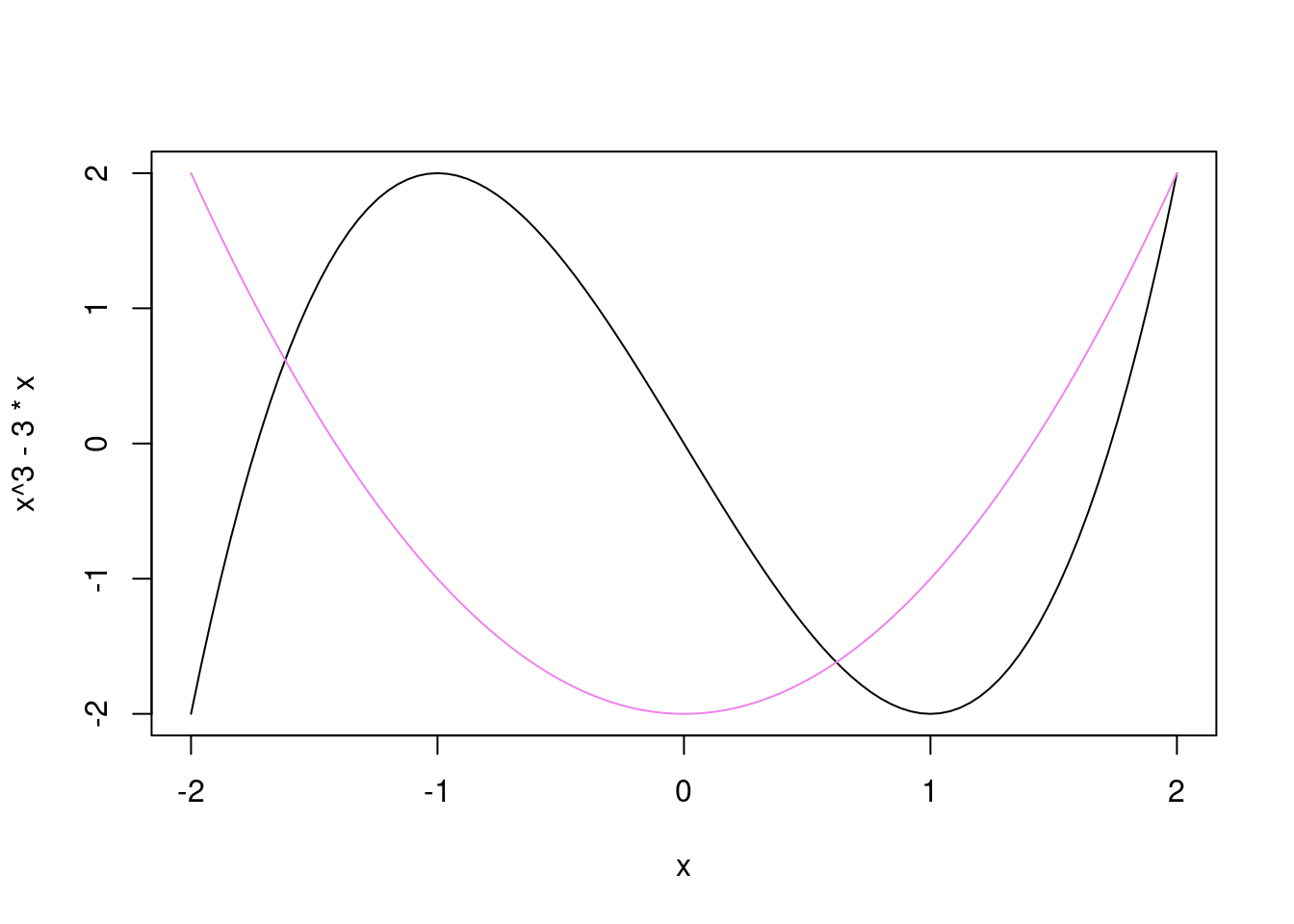
## Curve
```{r}
curve(x^3 - 3*x, from = -2, to = 2)
curve(x^2 - 2, add = TRUE, col = "violet")
```
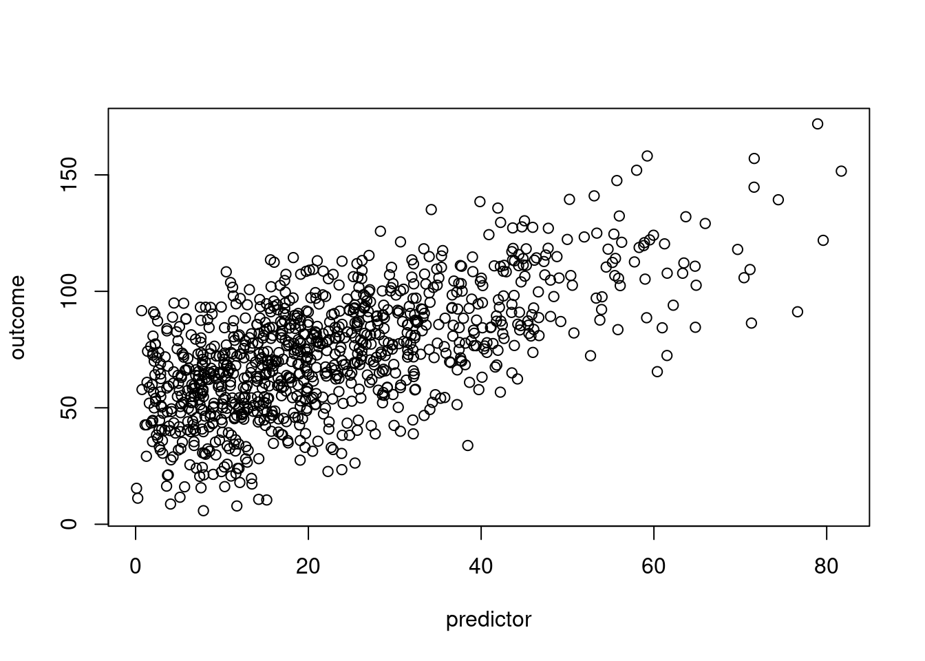
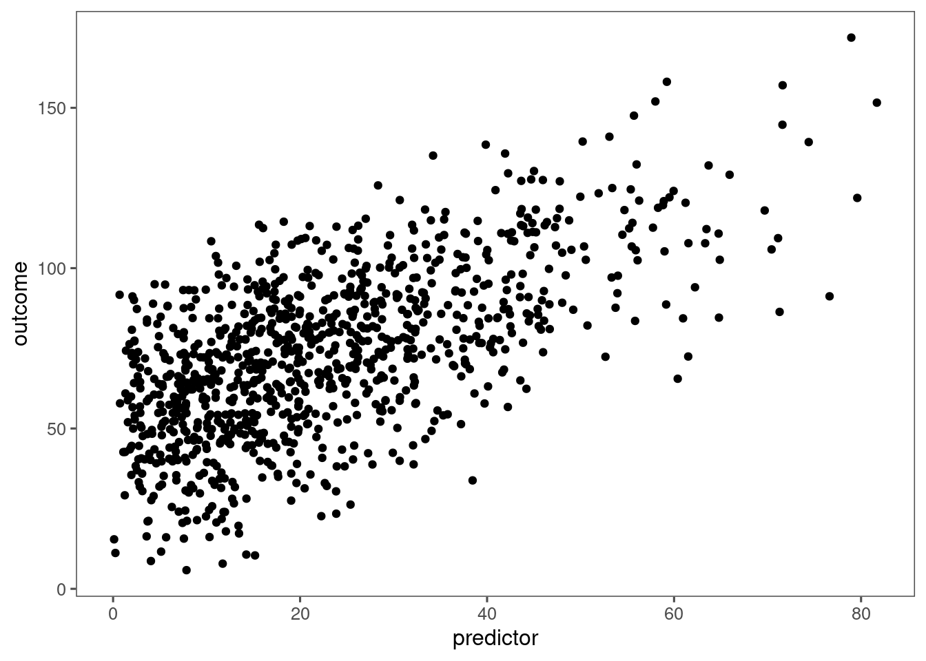
## Basic Scatterplot
### Base R
```{r}
plot(outcome ~ predictor, data = df)
plot(df$predictor, df$outcome)
```
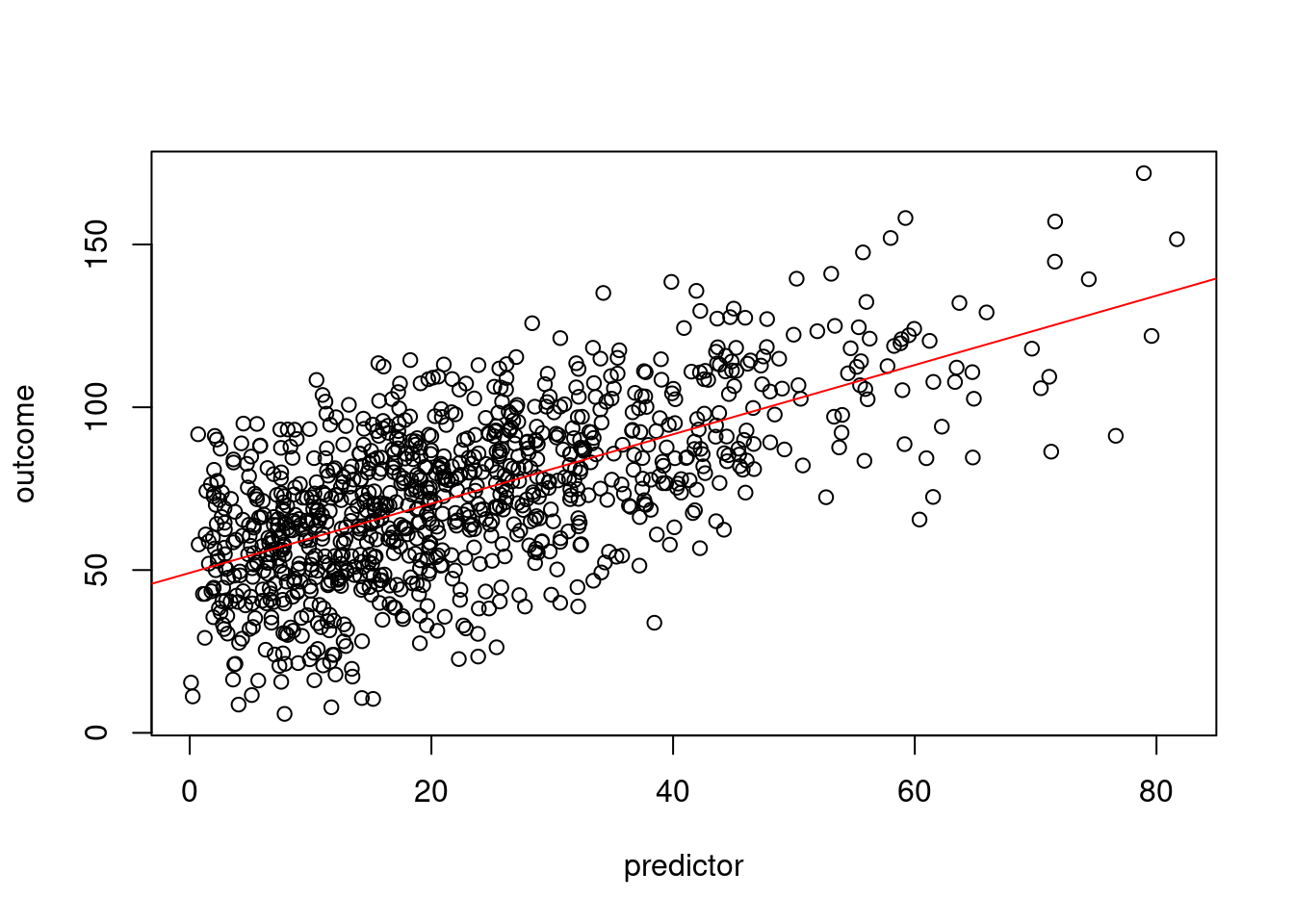
#### Best-fit line
```{r}
plot(outcome ~ predictor, data = df)
abline(lm(outcome ~ predictor, data = df), col = "red") #regression line (y~x)
```
#### Best-fit line with correlation coefficient
```{r}
plot(outcome ~ predictor, data = df)
abline(lm(outcome ~ predictor, data = df), col = "red") #regression line (y~x)
addText(x = df$predictor, y = df$outcome)
```
#### Loess line
```{r}
plot(outcome ~ predictor, data = df)
lines(loess.smooth(df$predictor, df$outcome)) #loess line (x,y)
```
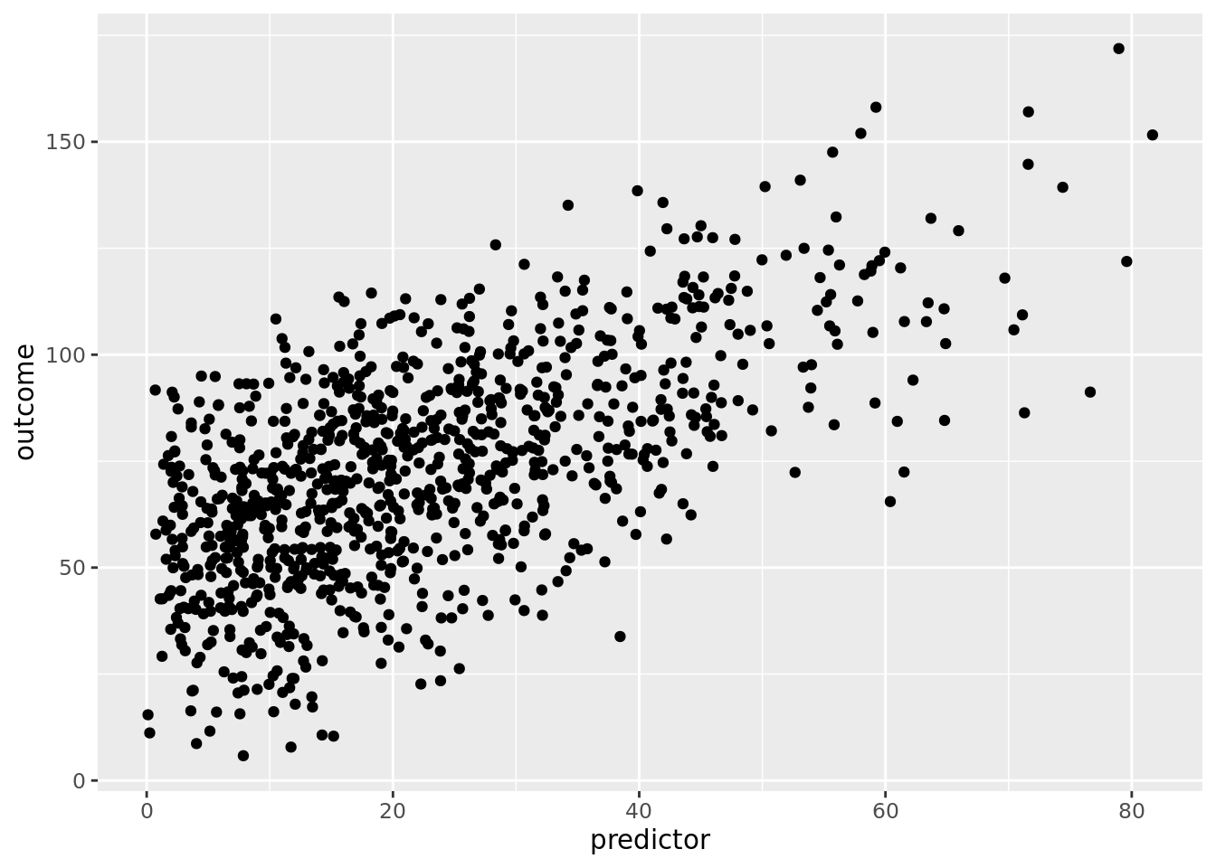
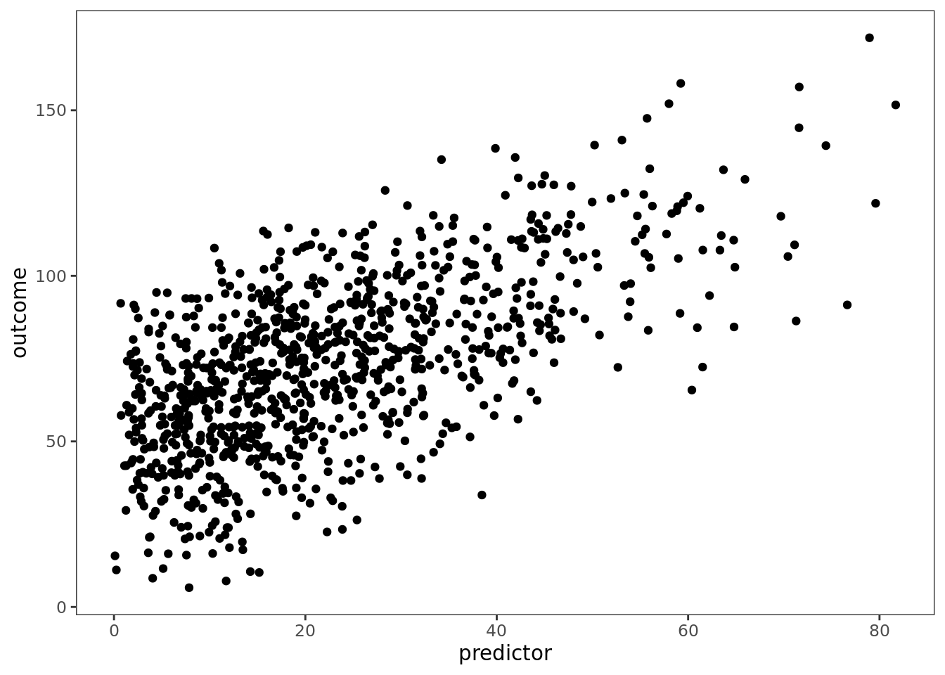
### `ggplot2`
```{r}
ggplot(df, aes(x = predictor, y = outcome)) +
  geom_point() +
  theme_classic()
```
#### Best-fit line
```{r}
ggplot(df, aes(x = predictor, y = outcome)) +
  geom_point() +
  stat_smooth(method = "lm", formula = y ~ x) +
  theme_classic()
```
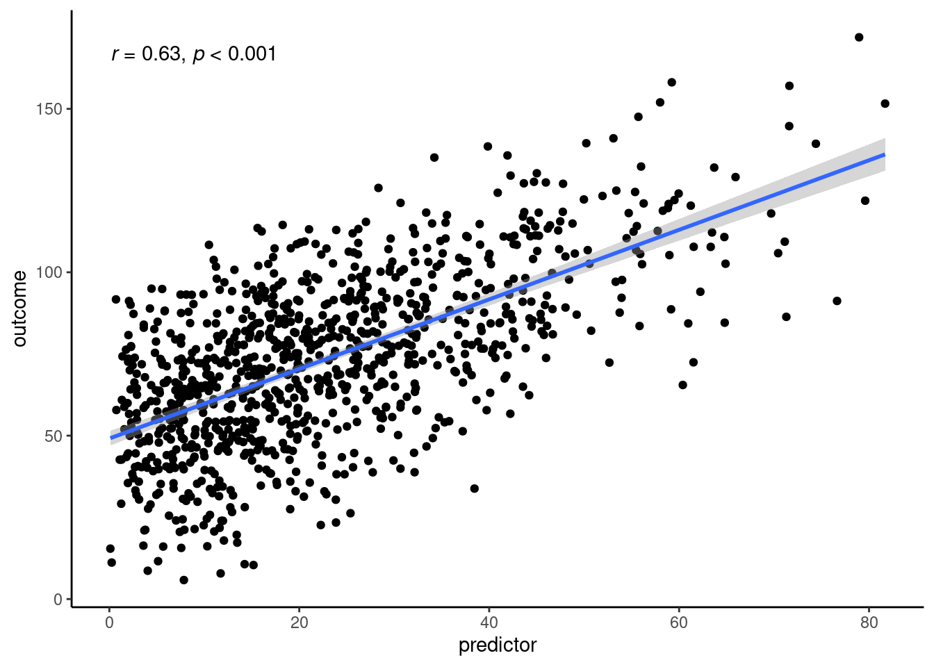
#### Best-fit line with correlation coefficient
```{r}
ggplot(df, aes(x = predictor, y = outcome)) +
  geom_point() +
  stat_smooth(method = "lm", formula = y ~ x) +
  stat_cor(
    cor.coef.name = "r",
    p.accuracy = 0.001,
    r.accuracy = 0.01) +
  theme_classic()
```
#### Loess line
```{r}
ggplot(df, aes(x = predictor, y = outcome)) +
  geom_point() +
  stat_smooth(method = "loess", formula = y ~ x) +
  theme_classic()
```
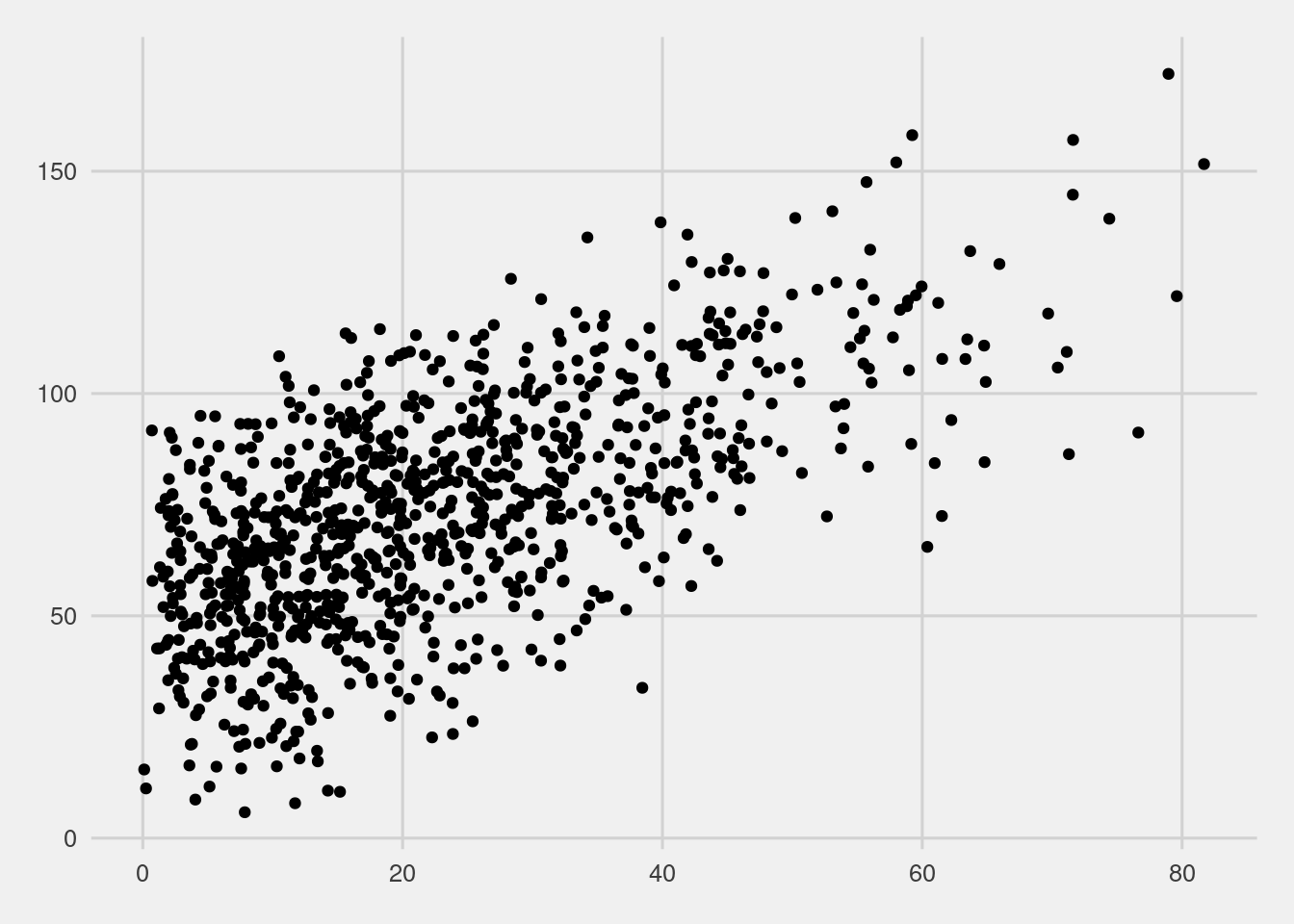
## Change Plot Style
### Change Theme
```{r}
basePlot <- ggplot(df, aes(x = predictor, y = outcome)) +
  geom_point()
```
#### Default Theme
```{r}
basePlot
```
#### Grayscale: `theme_gray()`
```{r}
basePlot + theme_gray() + theme(text = element_text(family = "Gotham"))
```
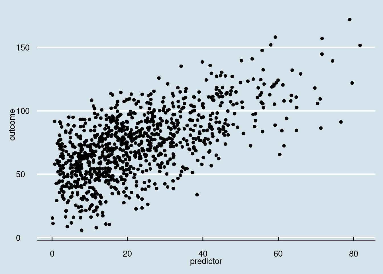
#### Black-and-White: `theme_bw()`
```{r}
basePlot + theme_bw() + theme(text = element_text(family = "Gotham"))
```
#### Line Drawing: `theme_linedraw()`
A theme with only black lines of various widths on white backgrounds, reminiscent of a line drawing.
Note that this theme has some very thin lines (<< 1 pt) which some journals may refuse.
```{r}
basePlot + theme_linedraw() + theme(text = element_text(family = "Gotham"))
```
#### Light: `theme_light()`
```{r}
basePlot + theme_light() + theme(text = element_text(family = "Gotham"))
```
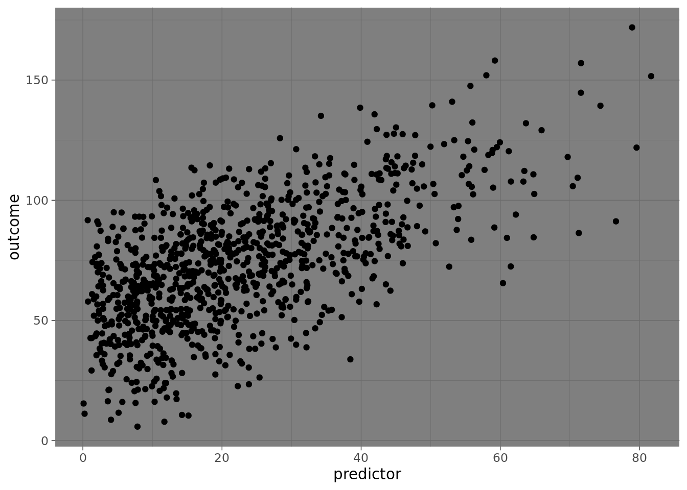
#### Dark: `theme_dark()`
```{r}
basePlot + theme_dark() + theme(text = element_text(family = "Gotham"))
```
#### Minimal: `theme_minimal()`
```{r}
basePlot + theme_minimal() + theme(text = element_text(family = "Gotham"))
```
#### Classic: `theme_classic()`
```{r}
basePlot + theme_classic() + theme(text = element_text(family = "Gotham"))
```
#### A Completely Empty Theme: `theme_void()`
```{r}
basePlot + theme_void() + theme(text = element_text(family = "Gotham"))
```
#### Visual Unit Tests: `theme_test()`
```{r}
basePlot + theme_test() + theme(text = element_text(family = "Gotham"))
```
#### Edward Tufte: `theme_tufte()`
Theme based on Edward Tufte.
```{r}
basePlot + theme_tufte()
```
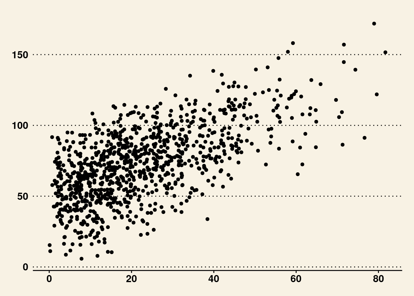
#### Wall Street Journal: `theme_wsj()`
Theme based on the publication, the Wall Street Journal.
```{r}
basePlot + theme_wsj()
```
#### FiveThirtyEight: `theme_fivethirtyeight()`
Theme based on the publication, FiveThirtyEight.
```{r}
basePlot + theme_fivethirtyeight()
```
#### The Economist: `theme_economist()`
Theme based on the publication, The Economist.
```{r}
basePlot + theme_economist()
```
#### Stephen Few: `theme_few()`
Theme based on the rules and examples from Stephen Few's *Show Me the Numbers* and "Practical Rules for Using Color in Charts".
```{r}
basePlot + theme_few()
```
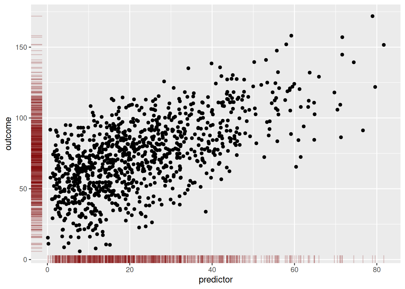
## Rug Plot
```{r}
basePlot +
  geom_rug(
    color = "#800000",
    alpha = 0.2
  )
```
## Add Marginal Distributions {#sec-marginalDistributions}
```{r}
scatterplot <- ggplot(df, aes(x = predictor, y = outcome)) +
  geom_point() +
  theme_classic() +
  theme(text = element_text(family = "Gotham"))
```
### Density Plot
```{r}
densityMarginal <- ggMarginal(scatterplot, type = "density", xparams = list(fill = "gray"), yparams = list(fill = "gray"))
```
```{r}
print(densityMarginal, newpage = TRUE)
```
(Or we can create the marginal figures manually using the `patchwork` package):
```{r}
densX <- ggplot2::ggplot(
  data = df,
  aes(
    x = predictor)) +
  coord_cartesian() + # expand = FALSE (if you want to remove the space between data and axis; if you use, would need to use expand = FALSE for all three plots)
  geom_density(
    fill = "gray",
    alpha = 0.6 # add transparency
  ) +
  theme_void()

densY <- ggplot2::ggplot(
  data = df,
  aes(
    x = outcome)) +
  geom_density(
    fill = "gray",
    alpha = 0.6 # add transparency
  ) +
  theme_void() +
  coord_flip() # expand = FALSE (if you want to remove the space between data and axis; if you use, would need to use expand = FALSE for all three plots)

densX + patchwork::plot_spacer() + scatterplot + densY +
  patchwork::plot_layout(
    ncol = 2,
    nrow = 2,
    widths = c(4, 1),
    heights = c(1, 4)
  )
```
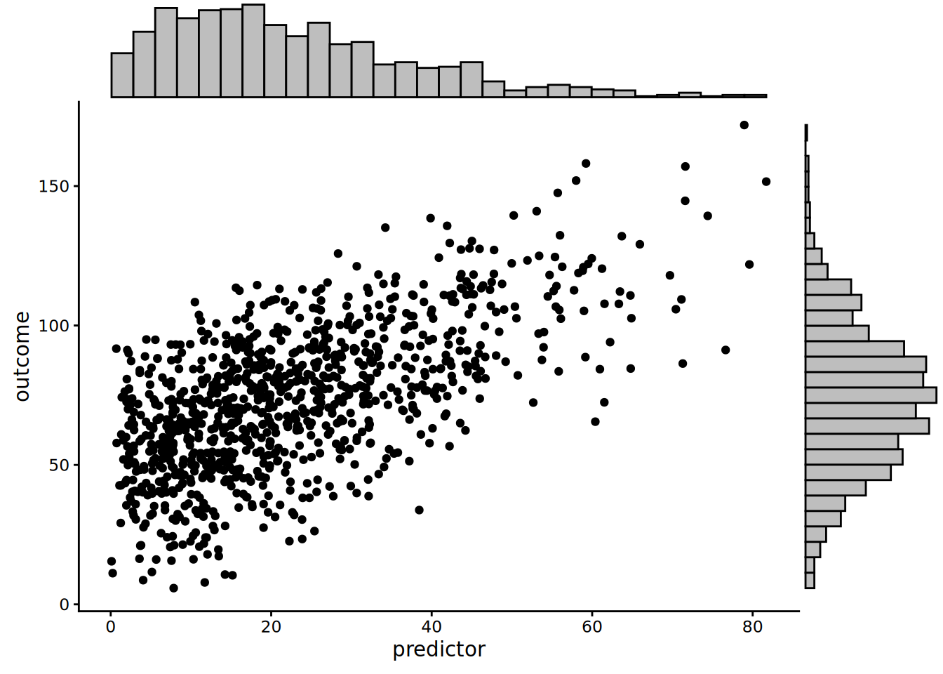
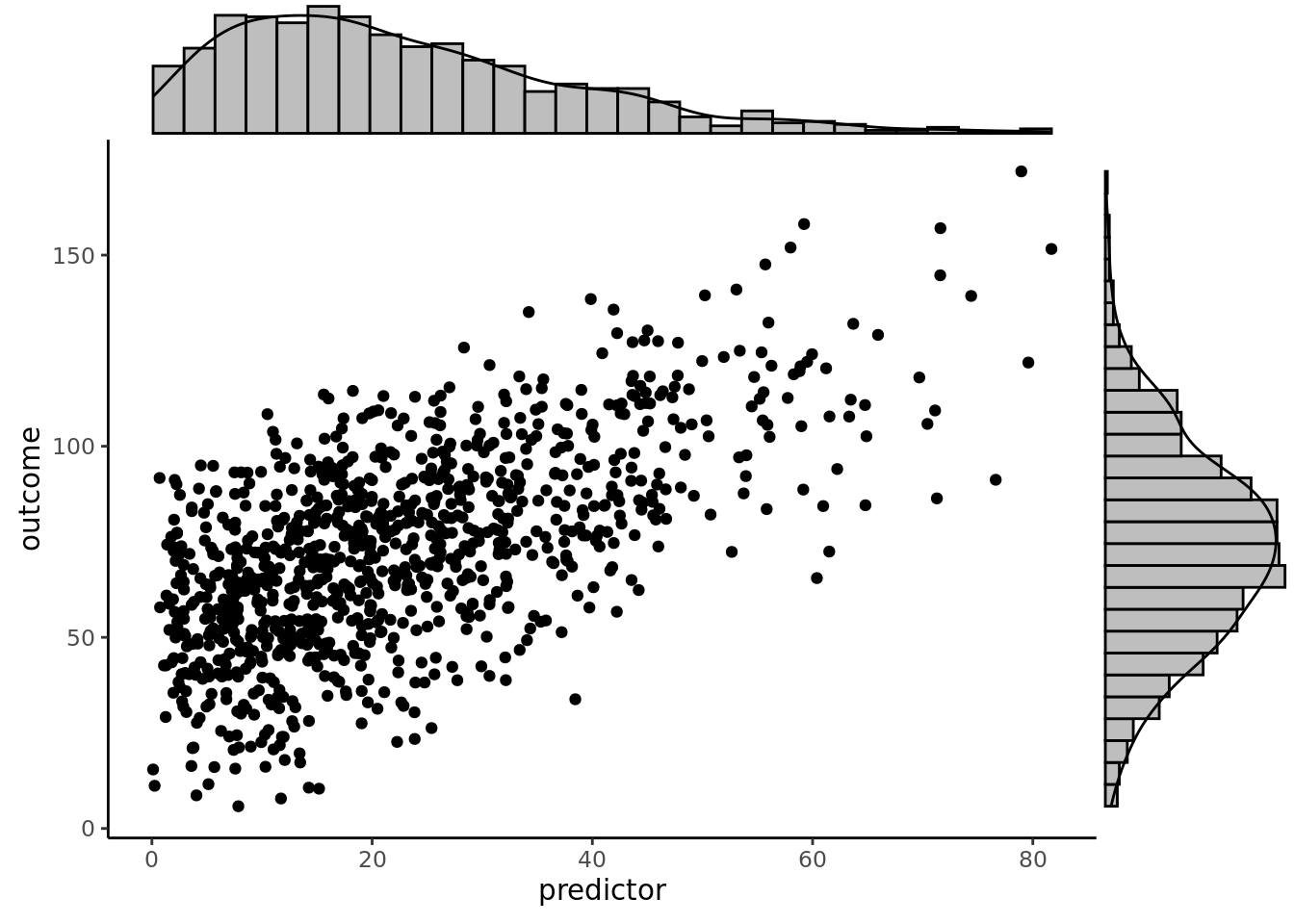
### Histogram
```{r}
histogramMarginal <- ggMarginal(scatterplot, type = "histogram", xparams = list(fill = "gray"), yparams = list(fill = "gray"))
```
```{r}
print(histogramMarginal, newpage = TRUE)
```
(Or we can create the marginal figures manually using the `patchwork` package):
```{r}
histX <- ggplot2::ggplot(
  data = df,
  aes(
    x = predictor)) +
  coord_cartesian() + # expand = FALSE (if you want to remove the space between data and axis; if you use, would need to use expand = FALSE for all three plots)
  geom_histogram(
    aes(y = after_stat(density)),
    color = "#000000",
    fill = "gray"
  ) +
  theme_void()

histY <- ggplot2::ggplot(
  data = df,
  aes(
    x = outcome)) +
  geom_histogram(
    aes(y = after_stat(density)),
    color = "#000000",
    fill = "gray"
  ) +
  theme_void() +
  coord_flip() # expand = FALSE (if you want to remove the space between data and axis; if you use, would need to use expand = FALSE for all three plots)

histX + patchwork::plot_spacer() + scatterplot + histY +
  patchwork::plot_layout(
    ncol = 2,
    nrow = 2,
    widths = c(4, 1),
    heights = c(1, 4)
  )
```
### Boxplot
```{r}
boxplotMarginal <- ggMarginal(scatterplot, type = "boxplot", xparams = list(fill = "gray"), yparams = list(fill = "gray"))
```
```{r}
print(boxplotMarginal, newpage = TRUE)
```
(Or we can create the marginal figures manually using the `patchwork` package):
```{r}
boxX <- ggplot2::ggplot(
  data = df,
  aes(
    x = predictor)) +
  coord_cartesian() + # expand = FALSE (if you want to remove the space between data and axis; if you use, would need to use expand = FALSE for all three plots)
  geom_boxplot(
    fill = "gray"
  ) +
  theme_void()

boxY <- ggplot2::ggplot(
  data = df,
  aes(
    x = outcome)) +
  geom_boxplot(
    fill = "gray"
  ) +
  theme_void() +
  coord_flip() # expand = FALSE (if you want to remove the space between data and axis; if you use, would need to use expand = FALSE for all three plots)

boxX + patchwork::plot_spacer() + scatterplot + boxY +
  patchwork::plot_layout(
    ncol = 2,
    nrow = 2,
    widths = c(4, 1),
    heights = c(1, 4)
  )
```
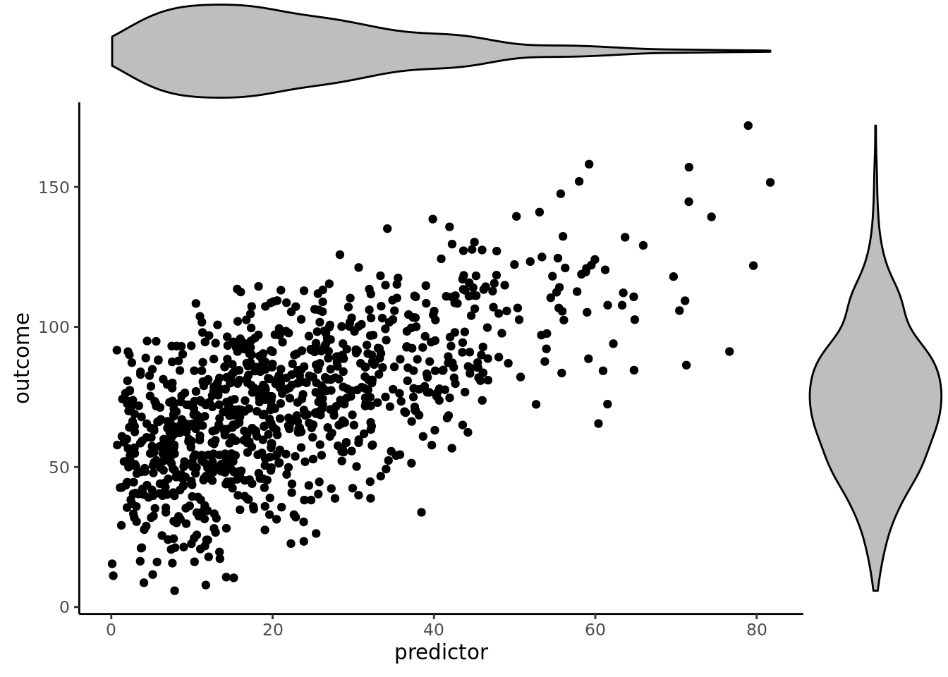
### Violin Plot
```{r}
violinMarginal <- ggMarginal(scatterplot, type = "violin", xparams = list(fill = "gray"), yparams = list(fill = "gray"))
```
```{r}
print(violinMarginal, newpage = TRUE)
```
(Or we can create the marginal figures manually using the `patchwork` package):
```{r}
violinX <- ggplot2::ggplot(
  data = df,
  aes(
    x = "",
    y = predictor)) +
  geom_violin(
    fill = "gray"
  ) +
  theme_void() +
  coord_flip() # expand = FALSE (if you want to remove the space between data and axis; if you use, would need to use expand = FALSE for all three plots)

violinY <- ggplot2::ggplot(
  data = df,
  aes(
    x = "",
    y = outcome)) +
  coord_cartesian() + # expand = FALSE (if you want to remove the space between data and axis; if you use, would need to use expand = FALSE for all three plots)
  geom_violin(
    fill = "gray"
  ) +
  theme_void()

violinX + patchwork::plot_spacer() + scatterplot + violinY +
  patchwork::plot_layout(
    ncol = 2,
    nrow = 2,
    widths = c(4, 1),
    heights = c(1, 4)
  )
```
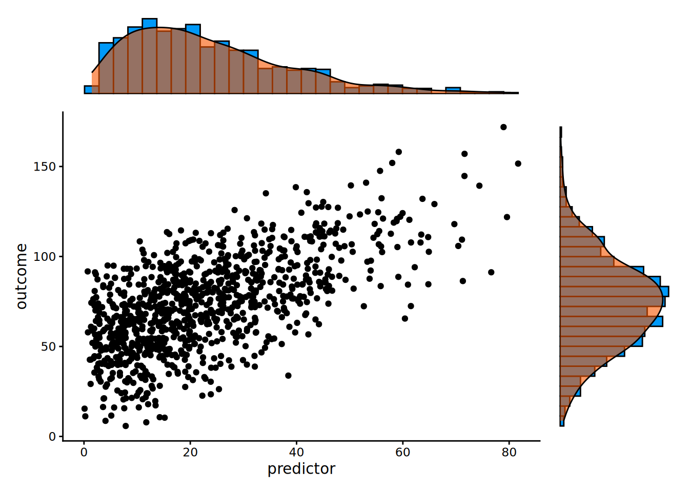
### Density Plot and Histogram
```{r}
densigramMarginal <- ggMarginal(scatterplot, type = "densigram", xparams = list(fill = "gray"), yparams = list(fill = "gray"))
```
```{r}
print(densigramMarginal, newpage = TRUE)
```
(Or we can create the marginal figures manually using the `patchwork` package):
```{r}
densHistX <- ggplot2::ggplot(
  data = df,
  aes(
    x = predictor)) +
  coord_cartesian() + # expand = FALSE (if you want to remove the space between data and axis; if you use, would need to use expand = FALSE for all three plots)
  geom_histogram(
    aes(y = after_stat(density)),
    color = "#000000",
    fill = "#0099F8"
  ) +
  geom_density(
    color = "#000000",
    fill = "#F85700",
    alpha = 0.6 # add transparency
  ) +
  theme_void()

densHistY <- ggplot2::ggplot(
  data = df,
  aes(
    x = outcome)) +
  geom_histogram(
    aes(y = after_stat(density)),
    color = "#000000",
    fill = "#0099F8"
  ) +
  geom_density(
    color = "#000000",
    fill = "#F85700",
    alpha = 0.6 # add transparency
  ) +
  theme_void() +
  coord_flip() # expand = FALSE (if you want to remove the space between data and axis; if you use, would need to use expand = FALSE for all three plots)

densHistX + patchwork::plot_spacer() + scatterplot + densHistY +
  patchwork::plot_layout(
    ncol = 2,
    nrow = 2,
    widths = c(4, 1),
    heights = c(1, 4)
  )
```
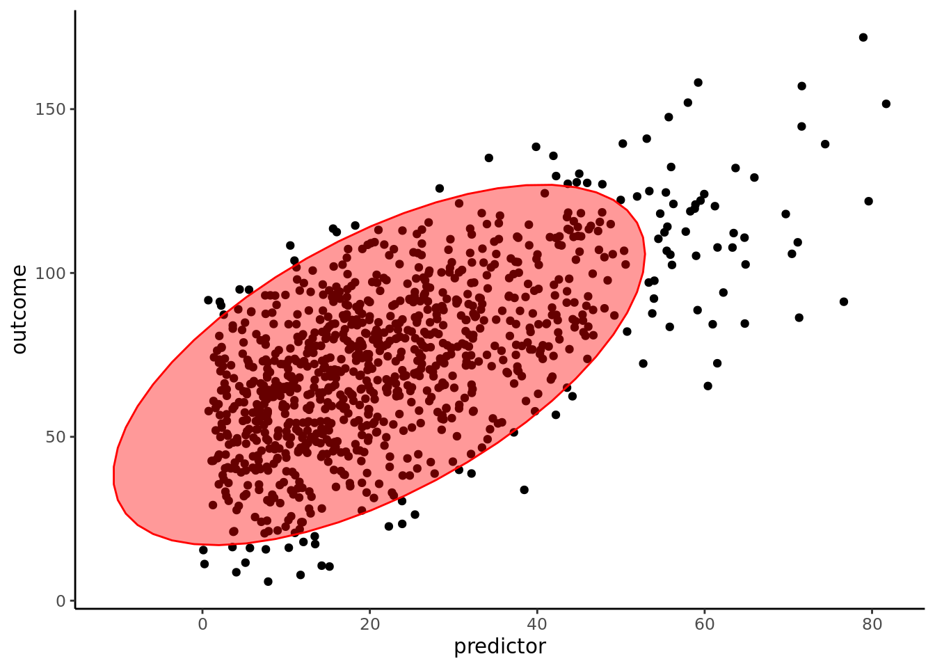
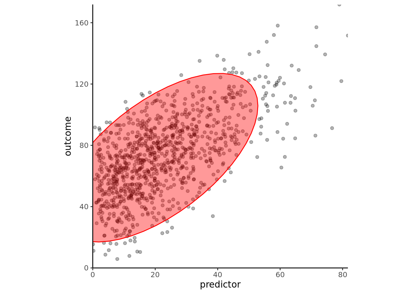
## Ellipse
### Basic Ellipse
```{r}
ggplot(df, aes(x = predictor, y = outcome)) +
  geom_point() +
  stat_ellipse(alpha = 0.4, level = 0.95, geom = "polygon", fill = "red", color = "red") +
  theme_classic() +
  theme(text = element_text(family = "Gotham"))
```
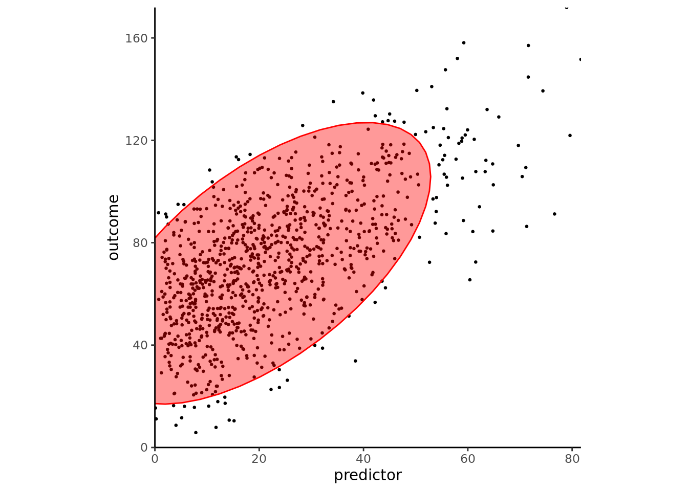
### Align Coordinates
```{r}
ggplot(df, aes(x = predictor, y = outcome)) +
  geom_point() +
  stat_ellipse(alpha = 0.4, level = 0.95, geom = "polygon", fill = "red", color = "red") +
  scale_x_continuous(expand = c(0, 0)) +
  scale_y_continuous(expand = c(0, 0)) +
  coord_fixed(ratio = (max(predictor, na.rm = TRUE) - min(predictor, na.rm = TRUE))/(max(outcome, na.rm = TRUE) - min(outcome, na.rm = TRUE)),
              xlim = c(0, max(predictor, na.rm = TRUE)),
              ylim = c(0, max(outcome, na.rm = TRUE))) +
  theme_classic() +
  theme(text = element_text(family = "Gotham"))
```
### Reduce Dot Size
```{r}
ggplot(df, aes(x = predictor, y = outcome)) +
  geom_point(size = 0.5) +
  stat_ellipse(alpha = 0.4, level = 0.95, geom = "polygon", fill = "red", color = "red") +
  scale_x_continuous(expand = c(0, 0)) +
  scale_y_continuous(expand = c(0, 0)) +
  coord_fixed(ratio = (max(predictor, na.rm = TRUE) - min(predictor, na.rm = TRUE))/(max(outcome, na.rm = TRUE) - min(outcome, na.rm = TRUE)),
              xlim = c(0, max(predictor, na.rm = TRUE)),
              ylim = c(0, max(outcome, na.rm = TRUE))) +
  theme_classic() +
  theme(text = element_text(family = "Gotham"))
```
### Transparency
```{r}
ggplot(df, aes(x = predictor, y = outcome)) +
  geom_point(alpha = 0.3) +
  stat_ellipse(alpha = 0.4, level = 0.95, geom = "polygon", fill = "red", color = "red") +
  scale_x_continuous(expand = c(0, 0)) +
  scale_y_continuous(expand = c(0, 0)) +
  coord_fixed(ratio = (max(predictor, na.rm = TRUE) - min(predictor, na.rm = TRUE))/(max(outcome, na.rm = TRUE) - min(outcome, na.rm = TRUE)),
              xlim = c(0, max(predictor, na.rm = TRUE)),
              ylim = c(0, max(outcome, na.rm = TRUE))) +
  theme_classic() +
  theme(text = element_text(family = "Gotham"))
```
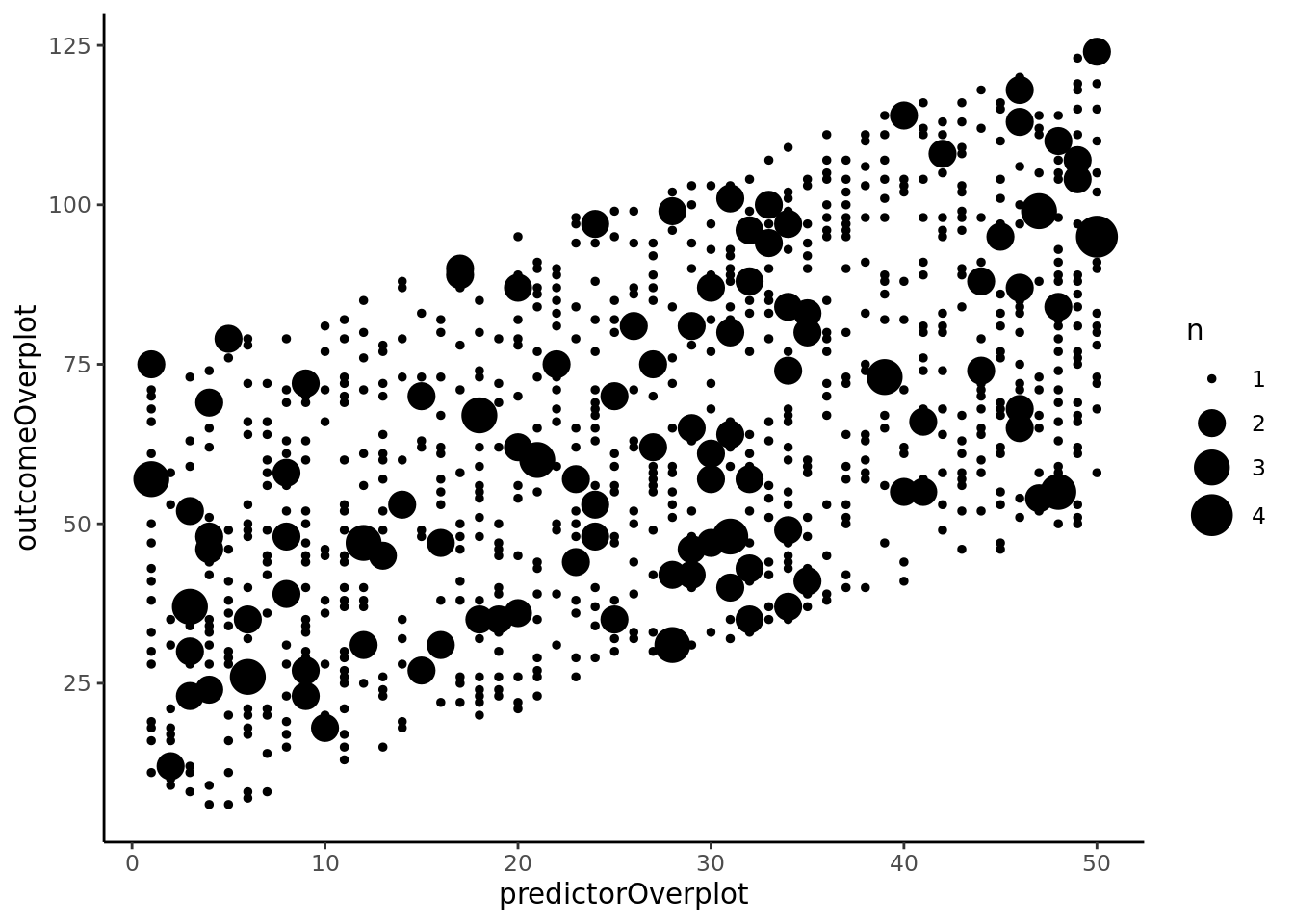
## Bubble Chart
### Basic Bubble Chart
```{r}
ggplot(df, aes(x = predictorOverplot, y = outcomeOverplot)) +
  geom_count(aes(size = ..n..)) +
  scale_size_area() +
  theme_classic() +
  theme(text = element_text(family = "Gotham"))
```
### Specify Sizes
```{r}
ggplot(df, aes(x = predictorOverplot, y = outcomeOverplot)) +
  geom_count(aes(size = ..n..)) +
  scale_size_continuous(breaks = c(1, 2, 3, 4), range = c(1, 7)) +
  theme_classic() +
  theme(text = element_text(family = "Gotham"))
```
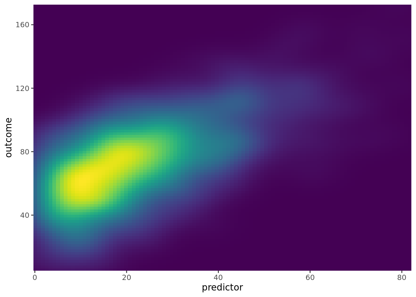
## 2-Dimensional Density
```{r}
ggplot(df, aes(x = predictor, y = outcome)) +
  stat_density_2d(aes(fill = ..density..), geom = "raster", contour = FALSE) +
  scale_x_continuous(expand = c(0, 0)) +
  scale_y_continuous(expand = c(0, 0)) +
  scale_fill_viridis() +
  theme(
    legend.position = "none",
    text = element_text(family = "Gotham")
  )
```
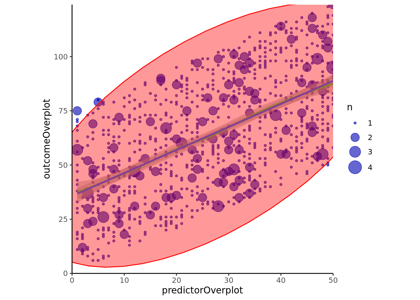
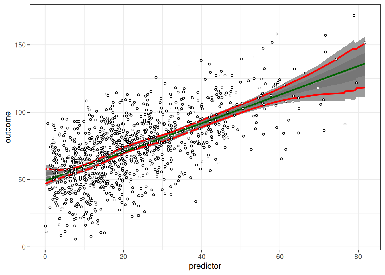
## Combined Ellipse and Bubble Chart
### `ggplot2`
```{r}
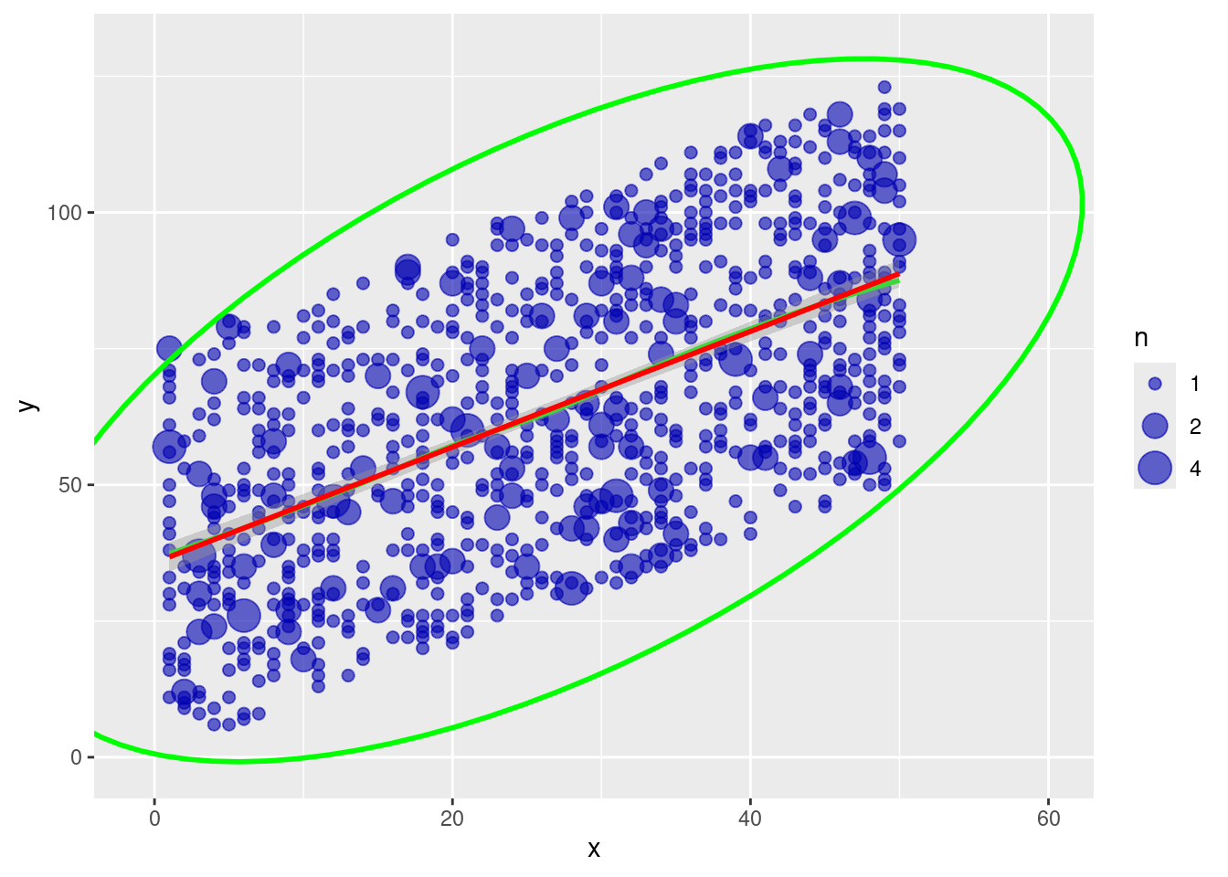
ggplot(df, aes(x = predictorOverplot, y = outcomeOverplot)) +
  geom_count(alpha = .6, color = rgb(0,0,.7,.5)) +
  scale_size_continuous(breaks = c(1, 2, 3, 4), range = c(1, 7)) +
  stat_smooth(method = "loess", se = TRUE, color = "green") +
  stat_smooth(method = "lm") +
  stat_ellipse(alpha = 0.4, level = 0.95, geom = "polygon", fill = "red", color = "red") +
  scale_x_continuous(expand = c(0, 0)) +
  scale_y_continuous(expand = c(0, 0)) +
  coord_fixed(ratio = (max(predictorOverplot, na.rm = TRUE) - min(predictorOverplot, na.rm = TRUE))/(max(outcomeOverplot, na.rm = TRUE) - min(outcomeOverplot, na.rm = TRUE)),
              xlim = c(0, max(predictorOverplot, na.rm = TRUE)),
              ylim = c(0, max(outcomeOverplot, na.rm = TRUE))) +
  theme_classic() +
  theme(text = element_text(family = "Gotham"))
ggplot(df, aes(x = predictorOverplot, y = outcomeOverplot)) +
  geom_count(alpha = .6, color = rgb(0,0,.7,.5)) +
  scale_size_continuous(breaks = c(1, 2, 3, 4), range = c(1, 7)) +
  stat_smooth(method = "loess", se = TRUE, color = "green") +
  stat_smooth(method = "lm") +
  stat_ellipse(color = "red", size = 1.5) +
  scale_x_continuous(expand = c(0, 0)) +
  scale_y_continuous(expand = c(0, 0)) +
  coord_fixed(ratio = (max(predictorOverplot, na.rm = TRUE) - min(predictorOverplot, na.rm = TRUE))/(max(outcomeOverplot, na.rm = TRUE) - min(outcomeOverplot, na.rm = TRUE)),
              xlim = c(0, max(predictorOverplot, na.rm = TRUE)),
              ylim = c(0, max(outcomeOverplot, na.rm = TRUE))) +
  theme_classic() +
  theme(text = element_text(family = "Gotham"))
```
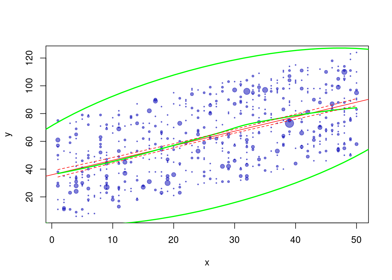
### Other implementation
From: <https://stats.stackexchange.com/questions/7899/complex-regression-plot-in-r>
#### `ggplot2`
```{r}
df$x <- df$predictorOverplot
df$y <- df$outcomeOverplot

xc <- with(df, xyTable(x, y))
df2 <- cbind.data.frame(x = xc$x, y = xc$y, number = xc$number)
df2$n <- cut(df2$number, c(0,1.5,2.5,Inf), labels = c(1,2,4))
df.ell <- as.data.frame(with(df, ellipse(cor(df$x, df$y, use = "pairwise.complete.obs"),
                                         scale = c(sd(df$x, na.rm = TRUE), sd(df$y, na.rm = TRUE)),
                                         centre = c(mean(df$x, na.rm = TRUE), mean(df$y, na.rm = TRUE)),
                                         level = .95)))

ggplot(data = na.omit(df2), aes(x = x, y = y)) +
  geom_point(aes(size = n), alpha = .6, color = rgb(0,0,.7,.5)) +
  stat_smooth(data = df, method = "loess", se = FALSE, color = "green") +
  stat_smooth(data = df, method = "lm", col = "red") +
  geom_path(data = df.ell, colour = "green", size = 1) +
  coord_cartesian(xlim = c(-1,60), ylim = c(-1,130))
```
#### Base `R`
```{r}
do.it <- function(df, type="confidence", ...) {
  require(ellipse)
  lm0 <- lm(y ~ x, data=df)
  xc <- with(df, xyTable(x, y))
  df.new <- data.frame(x = seq(min(df$x), max(df$x), 0.1))
  pred.ulb <- predict(lm0, df.new, interval = type)
  pred.lo <- predict(loess(y ~ x, data = df), df.new)
  plot(xc$x, xc$y, cex = xc$number*1/4, xlab = "x", ylab = "y", ...) #change number*X to change dot size
  abline(lm0, col = "red")
  lines(df.new$x, pred.lo, col="green", lwd = 2)
  lines(df.new$x, pred.ulb[,"lwr"], lty = 2, col = "red")
  lines(df.new$x, pred.ulb[,"upr"], lty = 2, col = "red")
  lines(ellipse(cor(df$x, df$y), scale=c(sd(df$x),sd(df$y)),
                centre = c(mean(df$x), mean(df$y)), level = .95), lwd = 2, col = "green")
  invisible(lm0)
}

df3 <- na.omit(df[sample(nrow(df), nrow(df), rep = TRUE),])
df3$x <- df3$predictorOverplot
df3$y <- df3$outcomeOverplot

do.it(df3, pch = 19, col = rgb(0,0,.7,.5))
```
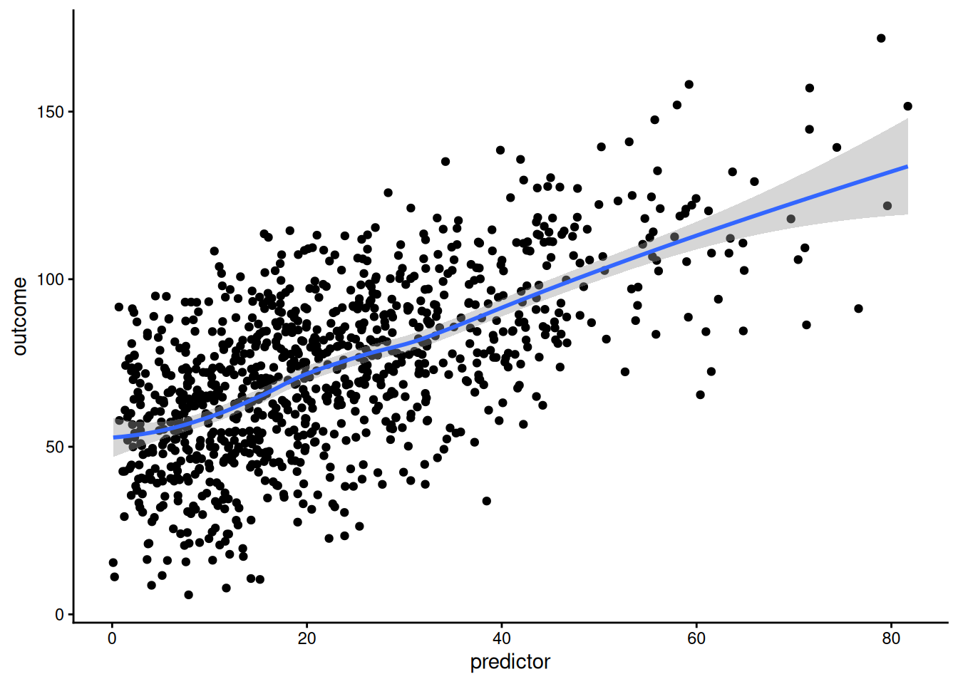
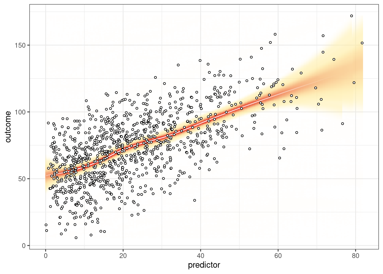
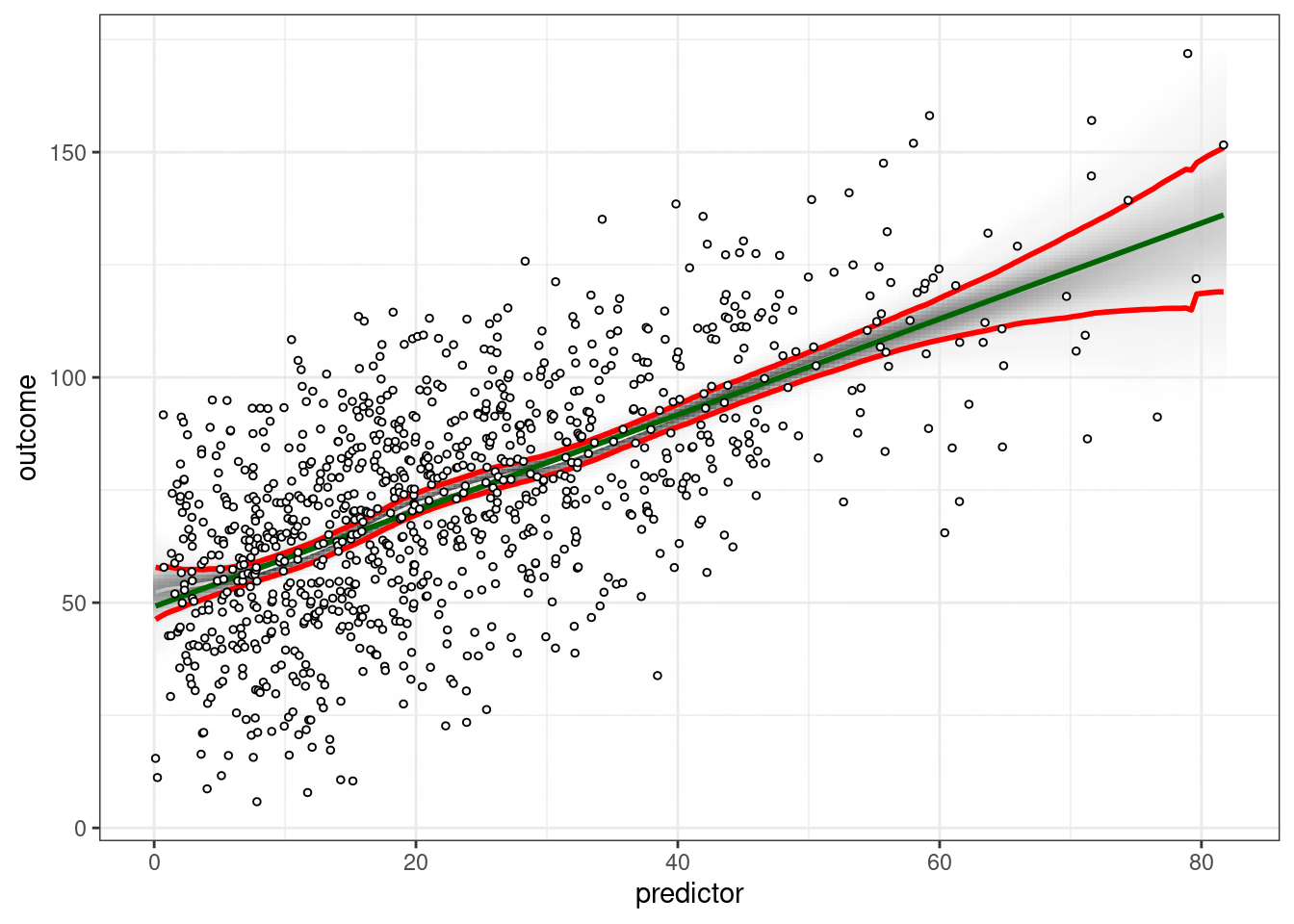
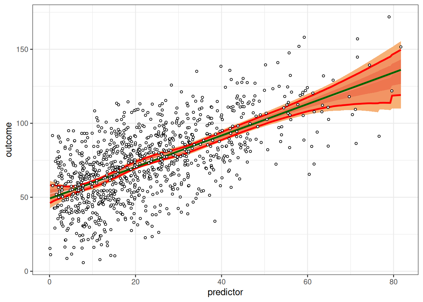
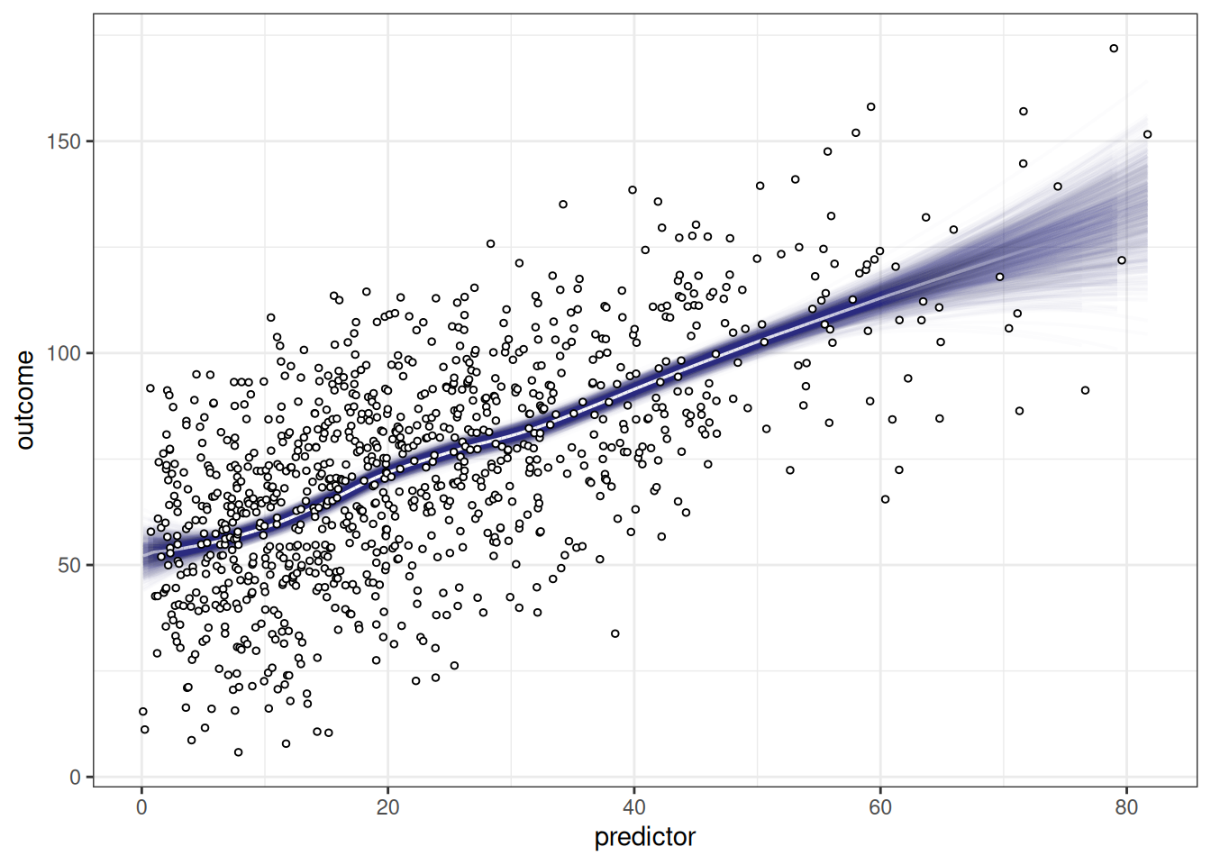
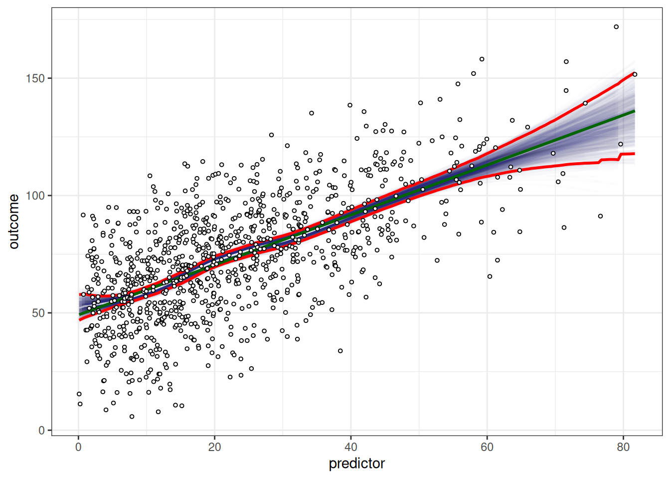
## Visually-Weighted Regression
### Default
```{r}
#| results: false
vwReg(outcome ~ predictor, data = df)
```
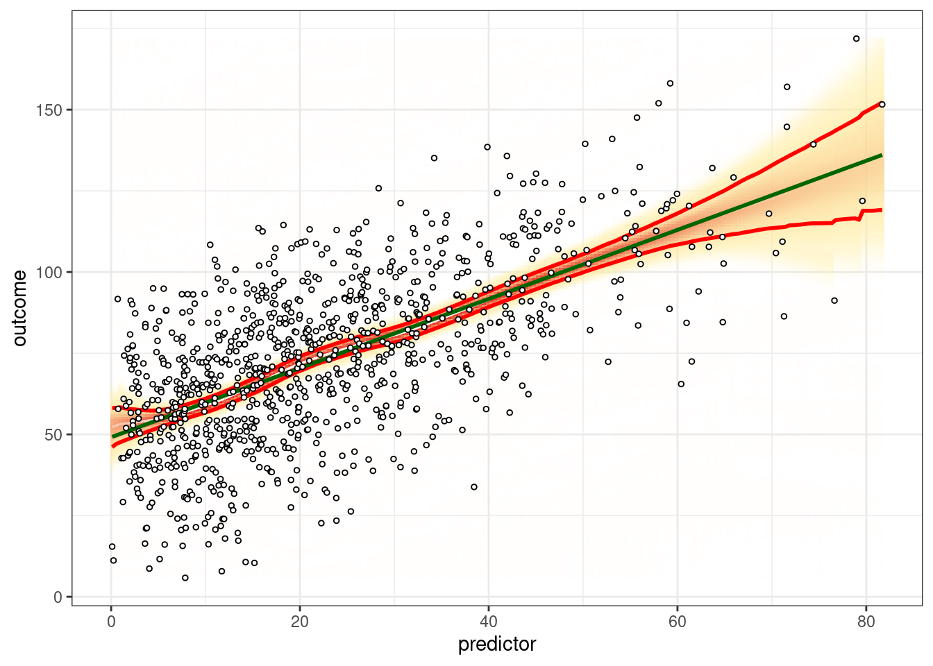
### Shade
```{r}
#| results: false
vwReg(outcome ~ predictor, data = df, shade = TRUE, spag = FALSE, show.lm = TRUE, show.CI = TRUE, bw = FALSE, B = 1000, quantize = "continuous")
vwReg(outcome ~ predictor, data = df, shade = TRUE, spag = FALSE, show.lm = TRUE, show.CI = TRUE, bw = FALSE, B = 1000, quantize = "SD")
```
### Spaghetti
```{r}
vwReg(outcome ~ predictor, data = df, shade = FALSE, spag = TRUE, show.lm = TRUE, show.CI = TRUE, bw = FALSE, B = 1000)
vwReg(outcome ~ predictor, data = df, shade = FALSE, spag = TRUE, show.lm = FALSE, show.CI = FALSE, bw = FALSE, B = 1000)
```
### Black/white
```{r}
#| results: false
vwReg(outcome ~ predictor, data = df, shade = TRUE, spag = FALSE, show.lm = TRUE, show.CI = TRUE, bw = TRUE, B = 1000, quantize = "continuous")
vwReg(outcome ~ predictor, data = df, shade = TRUE, spag = FALSE, show.lm = TRUE, show.CI = TRUE, bw = TRUE, B = 1000, quantize = "SD")
vwReg(outcome ~ predictor, data = df, shade = FALSE, spag = TRUE, show.lm = TRUE, show.CI = TRUE, bw = TRUE, B = 1000, quantize = "SD")
```
# Graphic Design Principles for Data Visualization
<https://www.data-to-viz.com/caveats.html>
# Types of Plots
## Univariate Distribution
Used for: distribution of one numeric variable
### Gallery
- Violin chart: <https://r-graph-gallery.com/violin.html>
- Density chart: <https://r-graph-gallery.com/density-plot.html>
- Histogram: <https://r-graph-gallery.com/histogram.html>
- Boxplot: <https://r-graph-gallery.com/boxplot.html>
- Ridgeline chart: <https://r-graph-gallery.com/ridgeline-plot.html>
## Bivariate Scatterplots
Used for: association between two numeric variables
### Base `R`
```
plot(x, y)
```
### ggplot2 package
<http://www.cookbook-r.com/Graphs/Scatterplots_(ggplot2)/>
```
ggplot(data, aes(x, y)) +
    geom_point()
```
### Gallery
- Scatterplot: <https://r-graph-gallery.com/scatterplot.html>
- Bubble plot: <https://r-graph-gallery.com/bubble-chart.html>
- 2D density chart: <https://r-graph-gallery.com/2d-density-chart.html>
- Heatmap: <https://r-graph-gallery.com/heatmap.html>
### Add lines
- Line chart: <https://r-graph-gallery.com/line-plot.html>
- Connected scatterplot: <https://r-graph-gallery.com/connected-scatterplot.html>
- Visually-weighted regression: <https://www.nicebread.de/visually-weighted-watercolor-plots-new-variants-please-vote/>
- Use the `vwReg()` function from the `petersenlab` package: <https://github.com/DevPsyLab/petersenlab/blob/main/R/vwReg.R>
### Area
- Area chart: <https://r-graph-gallery.com/area-chart.html>
- Stacked area chart: <https://r-graph-gallery.com/stacked-area-graph.html>
- Streamgraph: <https://r-graph-gallery.com/streamgraph.html>
## Bivariate Barplots
Used for: association between one categorical variable and one numeric variable (or for depicting the frequency of categories of a categorical variable)
### Gallery
- Barplot: <https://r-graph-gallery.com/barplot.html>
- Lollipop plot: <https://r-graph-gallery.com/lollipop-plot.html>
## Multivariate Correlation Matrices
Used for: association between multiple numeric variables
For correlation matrices, I do the following:
1. I use the lab's `cor.table()` function (with `type = "manuscript"`) from the `petersenlab` package to create a correlation matrix.
1. I save the correlation matrix to a `.csv` file.
a. For example: <https://research-git.uiowa.edu/PetersenLab/SRS/SRS-SelfRegulationDevelopment/-/blob/master/Analyses/selfRegulationDevelopment.Rmd#self-regulation-measures>
1. I open the .csv file in Excel and create the table in Excel that can be copied and pasted to Word/Powerpoint/etc.
### Correlograms
- `corrplot` package: <https://cran.r-project.org/web/packages/corrplot/vignettes/corrplot-intro.html>
- `corrgram` package: <https://cran.r-project.org/web/packages/corrgram/vignettes/corrgram_examples.html>
#### Gallery
<https://r-graph-gallery.com/correlogram.html>
### Pairs panels
`psych` package: <https://personality-project.org/r/psych/help/pairs.panels.html>
I depict examples of correlograms and pairs panels here: <https://isaactpetersen.github.io/Principles-Psychological-Assessment/factor-analysis-pca.html#sec-correlations-factorAnalysis>
## Path Diagrams {#sec-pathDiagrams}
Used for: SEM/CFA/path analysis
If you are just trying to visualize the results of a SEM model fitted using the `lavaan` package, I recommend the [`semPlot`](https://doi.org/10.32614/CRAN.package.semPlot), [`lavaanPlot`](https://doi.org/10.32614/CRAN.package.lavaanPlot), or [`lavaangui`](https://doi.org/10.32614/CRAN.package.lavaangui) packages in `R`.
You can access a web application version of [`lavaangui`](https://doi.org/10.32614/CRAN.package.lavaangui) here: <https://lavaangui.org>.
You can see examples of `semPlot` here: <http://sachaepskamp.com/semPlot/examples> (archived at: <https://perma.cc/W2V4-C9C8>).
You can see examples of `lavaanPlot` here: <https://lavaanplot.alexlishinski.com/articles/intro_to_lavaanplot> (archived at: <https://perma.cc/ARZ7-MV24>).
You can see examples of `lavaangui` here: <https://doi.org/10.1080/10705511.2024.2420678>.
You can see examples of my implementation here: <https://isaactpetersen.github.io/Principles-Psychological-Assessment/structural-equation-modeling.html#sec-semModelPathDiagram-sem>
If you are trying to create a figure for a paper or poster, you might want something that you can draw and customize yourself.
I use Adobe Illustrator for hand-drawn figures.
You can look at various options below:
- `semPlot` package: <https://doi.org/10.32614/CRAN.package.semPlot>
- `lavaanPlot` package: <https://doi.org/10.32614/CRAN.package.lavaanPlot>
- `lavaangui` package: <https://doi.org/10.32614/CRAN.package.lavaangui>
- `Adobe Illustrator`
- `Draw.io`: <https://www.drawio.com> (formerly <https://www.diagrams.net>)
- `Onyx`: <https://onyx-sem.com>
- `yworks`: <https://www.yworks.com>
- `Microsoft Visio`: <https://www.microsoft.com/en-us/microsoft-365/visio/flowchart-software>
- `Microsoft Powerpoint`
- `AMOS`
- `Warppls`
- `Graphviz`: <https://graphviz.org>
- has an `R` port—this is what we use for our study flowchart via the `DiagrammeR` package: <https://rich-iannone.github.io/DiagrammeR/index.html>
- <https://app.diagrams.net>
- <https://github.com/jgraph/drawio-desktop/releases>
## Interactive
Gallery: <https://r-graph-gallery.com/interactive-charts.html>
## Animation
Gallery: <https://r-graph-gallery.com/animation.html>
## 3D
Gallery: <https://r-graph-gallery.com/3d.html>
# Color Palettes {#sec-colorPalettes}
- <https://colorbrewer2.org>
- <https://sites.stat.columbia.edu/tzheng/files/Rcolor.pdf> (archived at <https://perma.cc/8SYT-UC5U>)
## Sequential
- <https://colorbrewer2.org/#type=sequential&scheme=BuGn&n=3>
- viridis, cividis, etc.: <https://cran.r-project.org/web/packages/viridis/vignettes/intro-to-viridis.html>
## Diverging
- <https://colorbrewer2.org/#type=diverging&scheme=BrBG&n=3>
## Qualitative/Categorical
- <https://colorbrewer2.org/#type=qualitative&scheme=Accent&n=3>
- `Polychrome` package: <https://stackoverflow.com/a/62939405> (archived at <https://perma.cc/3HWM-MMFS>)
- `pals` package: <https://stackoverflow.com/a/41230685> (archived at <https://perma.cc/WH56-HMVD>)
Color palettes for color-blindness:
- `Safe` palette from the `rcartocolor` package: <https://stackoverflow.com/a/56066712> (archived at <https://perma.cc/WUH5-F4Z7>)
- Okabe Ito scale: <https://stackoverflow.com/a/56066712> (archived at <https://perma.cc/WUH5-F4Z7>)
### 8 Colors
```{r}
# From here: https://github.com/clauswilke/colorblindr/blob/master/R/palettes.R
# Two color palettes taken from the article ["Color Universal Design" by Okabe and Ito](https://web.archive.org/web/20210108233739/http://jfly.iam.u-tokyo.ac.jp/color/)
# The variant `palette_OkabeIto` contains a gray color, while `palette_OkabeIto_black` contains black instead

palette_OkabeIto <- c("#E69F00", "#56B4E9", "#009E73", "#F0E442", "#0072B2", "#D55E00", "#CC79A7", "#999999")

pie(rep(1, 8), col = palette_OkabeIto)
palette_OkabeIto_black <- c("#E69F00", "#56B4E9", "#009E73", "#F0E442", "#0072B2", "#D55E00", "#CC79A7", "#000000")

pie(rep(1, 8), col = palette_OkabeIto_black)
```
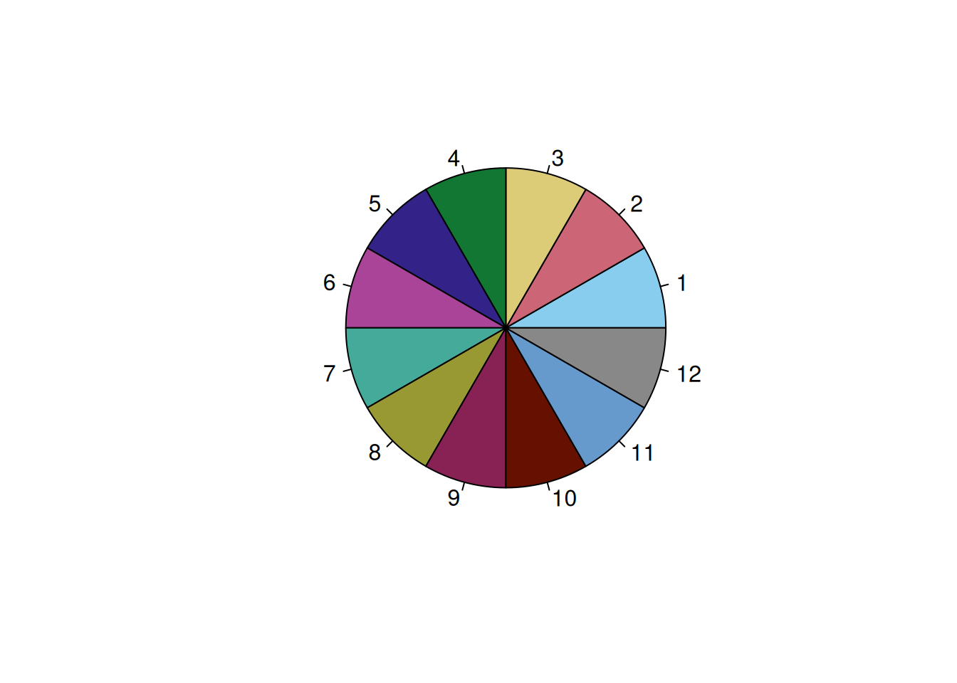
### 12 Colors
`Safe` palette from the `rcartocolor` package: <https://stackoverflow.com/a/56066712> (archived at <https://perma.cc/WUH5-F4Z7>)
```{r}
#from: scales::show_col(carto_pal(12, "Safe"))

c12 <- c(
  "#88CCEE",
  "#CC6677",
  "#DDCC77",
  "#117733",
  "#332288",
  "#AA4499",
  "#44AA99",
  "#999933",
  "#882255",
  "#661100",
  "#6699CC",
  "#888888"
)

pie(rep(1, 12), col = c12)
```
### 25 Colors
<https://stackoverflow.com/a/9568659> (archived at <https://perma.cc/5ALZ-3AQD>)
```{r}
c25 <- c(
  "dodgerblue2", "#E31A1C", # red
  "green4",
  "#6A3D9A", # purple
  "#FF7F00", # orange
  "black", "gold1",
  "skyblue2", "#FB9A99", # lt pink
  "palegreen2",
  "#CAB2D6", # lt purple
  "#FDBF6F", # lt orange
  "gray70", "khaki2",
  "maroon", "orchid1", "deeppink1", "blue1", "steelblue4",
  "darkturquoise", "green1", "yellow4", "yellow3",
  "darkorange4", "brown"
)

pie(rep(1, 25), col = c25)
```
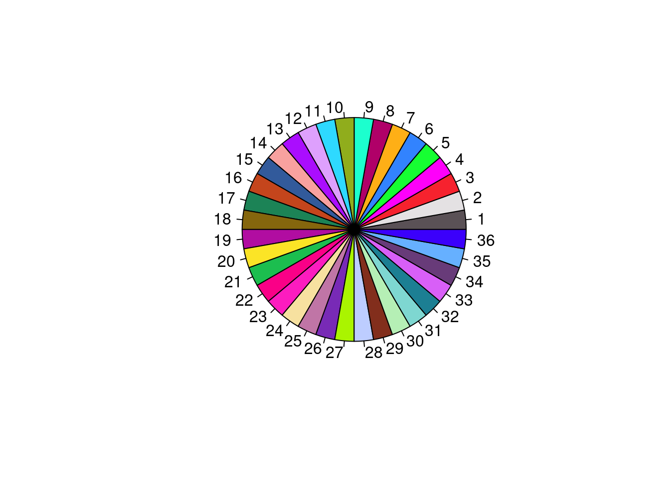
### 36 Colors
```{r}
# from: Polychrome::palette36.colors(36)

c36 <- c("#5A5156","#E4E1E3","#F6222E","#FE00FA","#16FF32","#3283FE","#FEAF16","#B00068","#1CFFCE","#90AD1C","#2ED9FF","#DEA0FD","#AA0DFE","#F8A19F","#325A9B","#C4451C","#1C8356","#85660D","#B10DA1","#FBE426","#1CBE4F","#FA0087",
"#FC1CBF","#F7E1A0","#C075A6","#782AB6","#AAF400","#BDCDFF","#822E1C","#B5EFB5","#7ED7D1","#1C7F93","#D85FF7","#683B79","#66B0FF","#3B00FB")

pie(rep(1, 36), col = c36)
```
## Maps
- <https://github.com/thomasp85/scico>
# Session Info
```{r}
#| code-fold: true
sessionInfo()
```
[^1]: Ask Dr. Petersen to give you access.